Showing posts with label 1985. Show all posts

Thursday, September 2, 2021

Happy Birthday Ms. CollectingCutch

My girlfriend and I have birthdays the same week.  Theyre seperated by a few years, but we typically celebrate our joint birthdays on the 3rd.

Her birthday is today.  We both have to work overtime and won't be able to do anything tonight.

My birthday is Saturday so it's more likely we do something over the weekend to celebrate.

Since she was born in 85, here are some 1985 inspired Topps (and 1 Donruss) designs.

2020 1985 Jersey Relic (prime patch) red parallel numbered to 25 copies

2020 Topps 1985 Jersey Relic (pinstripe)  black parallel numbered to 199 copies.

2020 Topps 1985 gold parallel numbered to 50 copies
2020 Topps 1985 design
This came courtesy of AJ from The Lost Collector

2013 Topps Archives (1985 design) Base, Gold Foil /199, Day Glow Orange parallel

2019 Donruss 1985 Relic
It is strange that Panini produced a card of Cutch in 2019 from his Pittsburgh days, but I'll take it.

That's all I have in terms of 1985 inspired designs sans one pink card I will be showing off next month...

Happy Birthday Ms. CollectingCutch

Monday, March 22, 2021

Hey! Can you give me a hand?

Every now and then I pick up an item for my Cutch collection that goes beyond cardboard and I get really excited about it.  I've shown off some pretty cool items in the past which I may go into a recap post in the future, but below is an item that is a first for me.

Above is my first pair of game used batting gloves.  They were both autographed by Andrew McCutchen and both have a game used inscription by Cutch.
They come certified by Hunt's Auctions.


Best of all though you can see Cutch wearing this style batting glove on a variety of his Phillies cards from 2019 to 2021.
2021 Topps 70 Years of Topps 1955 design insert
2020 Topps Fire green parallel
2019 Topps Heritage Throwback Uniform 5x7
2020 Topps Big League blue parallel
2020 Topps Series 2 Independance Day parallel
2020 Topps 1985 Patch relic red border
2020 Topps Museum
2019 Topps Tek purple
2020 Topps Triple Threads "Getting Started" gold triple relic parallel


How would you display an item like this? Shadowbox? Frame?
Both showing the signed side or one side,showing the game use? Should I put some 5x7s inside it? 
Give me your thoughts...

Tuesday, October 6, 2020

Orange is the New Pink

Each year during the month of October, I show off only pink (and shades of pink like magenta, peach, etc) to help raise awareness of Breast Cancer, a leading cause of death for females in the United States.  For each (meaningful, non spam) comment left by those that follow the blog I donate a dollar to hopefully help at least one woman get a much needed mammogram.  Early detection is key!!!

If you want to make your own private donation please visit the National Breast Cancer Foundation.  There is a donate button on the main page and it only takes a minute of your time.  Every little bit helps.

I have focused primarily on cards that only feature Andrew McCutchen on the card, but in recent years have also featured cards with a cameo appearance (either being seen on the card or as a name cameo on the back of the card).  Last year I created Falco Files which discussed players that replaced (Shane Falco Replacements movie reference) on an active roster, number worn, or trade.  I will continue to utilize these styles of posts as we celebrate the 4th Collecting Cutch Save Second Base event (I am no longer counting my first run on the Pirates Treasure Room I did back in 2014.)

Please be sure to click here for a Babe Ruth relic card I am offering as a contest prize to one lucky person who posts their own pink cards for the month.  I am matching the $1 per comment on YOUR BLOGS too if you show off pink cards. 

You ready to get started?
Today I will try to connect a pink themed card to...

Diane Guerrero

Diane was born in New Jersey, but lived most of her life in Boston.  Her family Is from Colombia and she has been an activist for reforming the immigration policy in the United States.
She appeared on the TV show, Jane The Virgin where she played Lina.
She has also appeared in the comic book TV series, Doom Patrol where she plays the role of Crazy Jane.
The actress has voiced wanting to appear in more super hero movies in the future.
The role she is most well known for involves her being Maritza Ramos, an inmate on Orange is the New Black.


This 2013 Topps Archives is actually considered an orange dayglow parallel, but looks more like a soft pink in hand.

It is based on the 1985 design.
The day glow parallel was exclusive to hobby stores for only one week.  After purchasing packs of 2013 Archives, hobby shops could sell a 5 card pack for .25.  Each pack contained 1 Day Glow card and 4 base cards.


For some comment chatter ideas please discuss if you ever watched Orange is the New Black, Jane the Virgin, actresses you want to see appear as super hero characters, or Topps Dayglow cards.  

Saturday, August 29, 2020

Digging through the Archives, how I wish they were made differently

In 2011 Topps issued a release called Lineage.  It featured active and retired players on a new design.

The set also showed the lineage of Topps by revisiting some of the more popular designs and creating insert sets around them.  The fans loved the idea and Topps never produced Lineage again.

Well not under the title of Lineage that is.

Beginning in 2012 Topps would go into their archives and create a set called Archives.  Each year Topps would utilize 3-4 different designs from their cardboard making history and feature players on a design (mostly from their non playing days).

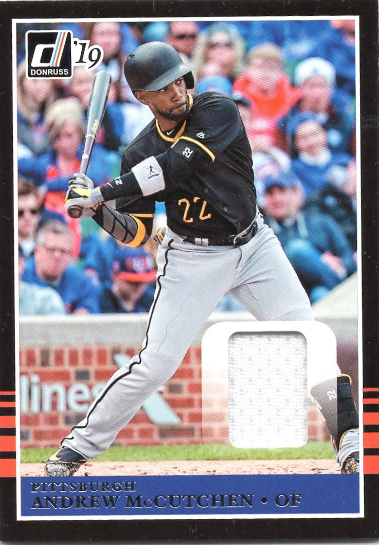
I have at minimum every base card of Andrew McCutchen from the Archives release and today I am going to post a series of designs I wish that McCutchen was used for over the first 8 years of existance of the brand.

2012 Topps Archives
Designs used by Topps: 1954, 1971, 1980, 1984
Design chosen by Topps for McCutchen

1971

While I like the design of 1971 and it is nice to have Cutch wearing the black and gold in a design from the year the Buccos won a World Series, I knew Cutch would eventually get the 1971 cardboard treatment in 2020 Topps Heritage.

I would have much rather gotten the 1954 design of Cutch.  No Pirates were represented using the 1954 design so it would have been an extra bonus to get Cutch in a 1954 design just for that reason.
Here is his Team USA teammate Adam Jones on the 1954 design.


2013 Archives
Designs used by Topps: 1972, 1982, 1985, 1990
Design chosen for McCutchen

1985

I am ok with this selection, but if I was given a choice of another design, I would lean towards 1990.  I don't see 1990 Topps as being a popular set by fans and can't imagine Topps using the design again until 2039 Topps Heritage. 


2014 Archives
Designs used by Topps: 1973, 1980, 1986, 1989 (the last year they use 4 designs)
Design chosen for McCutchen

1986

This is my favorite of all the Archives cards produced.  A strange thing about this card is that I think it may be an unannounced short print.  Try finding one on eBay or COMC right now.  You're likely to find less than a handful between all the after market places.  Try looking for any parallels including those sold on eBay, COMC, or WORTHPOINT and I promise you won't find any.  

Despite the perceived short print of this card, I approve this selection.


2015 Archives
Designs used by Topps: 1957, 1976, 1983
Design chosen for McCutchen

1983


I am so sick and tired of seeing modern players on 1983 designs.  Any of the other years would have been fine with me.  The 1983 design was also used for Josh Harrison and Bill Mazeroski.  The 1976 design was used for Gerrit Cole, Starling Marte, and Roberto Clemente.  

Given the choice I guess I would want Cutch in that 1957 design since Willie Stargell was the only Pirates player to get the 57 treatment.


2016 Archives
Designs used by Topps 1953, 1979, 1991
Design chosen for McCutchen

1991

Were it not for the Desert Shield foil variants I would have been begging for a 1953 Topps design.  It seems likely that Topps will continue to avoid putting Cutch in a Topps Living Set card even though JP Crawford and Bryce Harper already both have two entrants in the set.  I like the 91 set.  I have many fond memories opening these packs and trying to build the set with my dad.

No need for a change especially since I have this 1953 style card from 2019 Topps Transcendent.


2017 Archives
Designs used by Topps: 1960, 1982, 1992
Design chosen for McCutchen

1992


For many of the same reasons (foil parallel reminiscent of the ones available during initial release) I liked the 2016 Topps Archives selection of 1991 Topps, I am supporting the 2017 selection of 1992 Topps as the design for Cutch.  The design was also used for Roberto Clemente, Gregory Polanco, Starling Marte, and Gerrit Cole.

Cutch got a rookie card in 2009 Heritage High Number similar to the 1960 Topps rookie style made famous by the Yaz rookie.  Both Tyler Glasnow (rookie) and Honus Wagner represented the Pirates with the 1960 design.  I guess 1982 could have been a possibility since the double hockey stick style border was only used for Willie Stargell.
It seems Pops kept getting the short stick (no pun intended for this design) when being placed as a representative for the Pirates in Topps Archives.


2018 Archives
Designs used by Topps: 1959, 1977, 1981
Design chosen for McCutchen

1959


This is a selection that I approve, but given the choice of switching it up I would prefer 1981 Topps.  1959 is a great design and this is the only time Cutch got a solo card in the 1959 design.  However, he also got the 1959 treatment in the card "Bashers of the Bay" with Buster Posey. (Both pictured above)

So if that card was still produced, I would have liked to see a 1981 design for Cutch especially if it was given a pink border like what his team mate Buster Posey got.


2019 Archives
Designs used by Topps 1958, 1975, 1993
Design chosen for McCutchen

1958

This is actually a perfect selection among the designs offered.  As I have stated above McCutchen debuted in 2009 so his first Topps throwback design was 1960 Topps which appeared in 2009 Topps Heritage High Numbers.  He missed out on all the 1950s set via the traditional Heritage route.  The yellow background and red name letters make this card pop much in the same way Rip Repulski did in 1958.

The only other option for me would be 1993, but again that is only because I would want that gold foil found on Topps Gold style cards for that era.  The 1993 design isn't my favorite of the early 90s Topps designs.  Cutch did receive the 1975 design in 2011 Lineage.
2020 Archives
Designs used by Topps 1955, 1974, 2002
Design chosen for McCutchen

Nothing.
Cutch didn't receive a card in 2020 Topps.

This is an absolute shame that the streak of appearing in every Archives release comes to an end.  

Given the choices of 1955, 1974, and 2002 I would probably opt for 1955 Topps because it is an iconic set for Pirates fans (Roberto Clemente rookie!!!).
Getting a Cutch on a 1955 Topps design in his prime in a similar pose to the Clemente card would have been a perfect card.
Unfortunately Cutch is now with the Phillies and his 1955 style card may have resembled what this Steve Carlton looked like in Topps Archives.
My second choice would be 2002 Topps.  I wasn't collecting in 2002 and the set is so ugly I want a Cutch card to be represented in my collection with that ugly design.  
Former Pirates outfielder, Starling Marte, made it look kind of cool.


Have you ever looked at Topps Archives design samples and wished that a player got a different year treatment?

Monday, August 24, 2020

Anotha one...

I have ZERO desire to only post cards as they come, but with October only a month away there will be themed events that will cease posting only "new mail day" cards.

In the mean time, enjoy card number 3,002 in the Cutch PC.  
It is the 2020 gold parallel numbered to 50 copies of the 1985 35th anniversary insert card found in Series 2 Topps.
I like the image used for this card.  I am curious about the "gold" border though.  It looks a little weaker than other gold parallels we have seen from Topps in recent years.
The back has a serial number that makes this an eBay 1/2 (do the math, it's fun).  I like that it has his complete playing career stats, an interesting recent fact about him and a random baseball trivia question.  This card back is very true to the 1985 design.


A couple quick notes about my collection.
I have joined TCDB finally.  I literally just joined so if you see that I only have a dozen or so cards checked off it's because I plan on updating my list later this week.

I have also added a few cards to my Instagram.

Both names are CollectingCutch, the same as this blog and my Twitter.  I plan to join other social media places as well so keep your eyes out.

Are there any places you can suggest for increasing my social media presence of CollectingCutch?

Monday, August 17, 2020

Kindness Crushings

AJ from the terrific blog, The Lost Collector told me he was going to be sending me a PWE.
AJ has sent me a bunch of cards over the years, but nothing has ever looked like this.
Check out this art card he made for me!!!
Blake Jamieson of Project2020 would be proud.
He also sent along a 2020 Big League Baseball card of my other main PC, Charlie Morton.  Since Charlie got traded to Philadelphia in 2016 and ultimately left via free agency for Houston and Tampa Bay, my Ground Chuck PC has not been as big a focus as previously.  I still love to collect his cards, but I am way behind the "I own every Charlie Morton non 1/1 card" supercollection I once had.  There's just too many parallels these days to supercollect McCutchen and Morton.

This 1985 insert from 2020 Topps Series 2 was the main card of the PWE I was anticipating.  It's a nice photo of Cutch making a catch.
Thank you AJ!!!

I also got a card sent to me via Bryan on Twitter
Please follow Bryan on Twitter @I_am_steele
He posts a lot of cards for sale and is an incredibly kind neighbor of the north.